


Moodboards and logos?
I started by creating moodboards that helped define the key aspects the artist wanted to communicate visually. This stage included visual and typographic references that established the foundations of the creative process.
From there, I developed different logo proposals that explored ways to reflect the artist’s identity and style, exploring variations that could be easily adapted to different types of communication.

After experimenting with different typefaces and layouts, the final design feels dynamic and fluid, much like a signature using the artist’s name. It’s unique—just like his sound—and flexible to work alongside a logo symbol.


Once the logo was defined, and after receiving feedback from the artist, we moved on to the search for a color palette. The goal was to find colors that would complement and reflect the warmth of his music: which tones stand out? which ones does the artist feel best represent him?


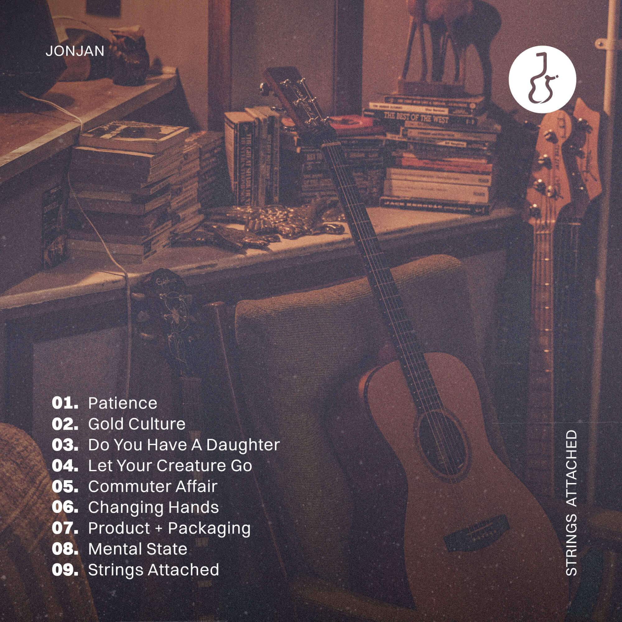
The established visual identity made it possible to develop and adapt the album’s design, including the CD and an additional booklet. All of this helped bring the process together, resulting in a clearer, more consistent, and well-integrated design.

