

My role:

Defining the brand's tone.
I began by exploring visual references and taking a close look at our competitors. Who are we up against in the market? What makes these brands stand out?
Based on this analysis, I defined the brand’s tone by what we wanted to communicate: an artisanal style with a vibrant touch that conveyed the vitality of the fruits. With this foundation, I started exploring logo proposals that blended freshness, color, and dynamism with a minimalist design, while the artisanal tone would be reflected in the other graphic elements.


An authentic and flexible visual system.
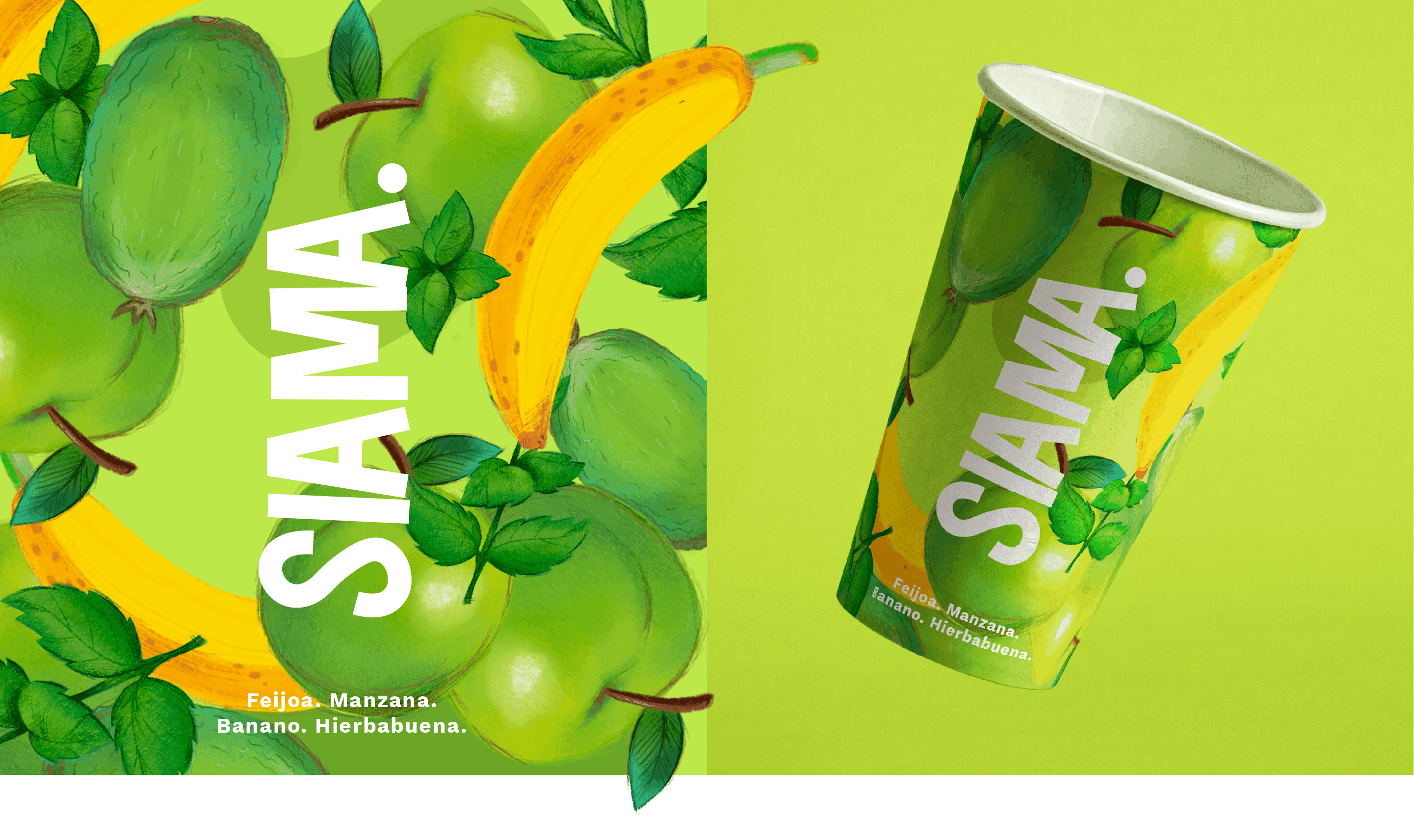
For the brand's color palette, I created a proposal featuring primary tones and secondary palettes specific to each smoothie flavor, paired with hand-drawn illustrations that bring out the brand's authentic personality and keep the fruit's vibrant energy alive.
The primary font is a clean sans serif, nicely balanced by a charming script display, giving us flexibility for different uses. Overall, I've crafted a versatile visual system that works well across both digital and print media, ensuring the brand's identity stays consistent and memorable.


The result was a fresh and dynamic identity that reflects the brand's essence and highlights its artisanal character and the quality of its products.


"Batut no es sólo una marca de batidos de frutas. Batut nace como un abrazo a los frutos que da nuestra tierra, es un homenaje a los campesinos colombianos que cultivan, labran y recogen los frutos, es la mezcla de sabores únicos que alimentan el cuerpo y el alma."

